Room for Improvement: designer Nat Buckley rethinks Energy Performance Certificates

Words and illustrations Nat Buckley
The consumer champions at Which? did an investigation over the summer, looking into the efficacy and usefulness of Energy Performance Certificates (EPCs). They found that they can be “riddled with inaccuracies and unhelpful advice that could cost homeowners a fortune”. Not good. We think about EPCs a lot, too. Energy performance is a vital part of the home buying decision and it’s clear that EPCs aren’t always helpful in understanding that. Being a design-led business we thought it’d be interesting to see whether a designer could help out, so we asked Nat Buckley to think about EPCs for us. Nat is a designer working in London, interested in interaction design and design-led invention. Here’s what they thought …
Lots of people looking to buy or rent a new home want to know whether it will be expensive to heat. Predicting the cost of running a property in advance is tricky, anything that provides some indication of that is going to be handy.
Luckily, there’s a regulatory requirement to have a property’s energy efficiency certified before selling it or renting it out, in the form of energy performance certificates (EPC). Energy efficiency and costs go hand in hand, so those certificates can be a useful data point in making a decision about where to live. Besides, the topic of energy efficiency is a great example of individual incentives and societal incentives aligning perfectly. Cheaper to run, lower CO2 emissions, better for the environment. Win win win.
As a designer I have a few ideas on how those certificates could be even more useful and reach more people. There’s so much work that has gone into making all this information available to buyers and renters, and I’d love more people to feel confident using it to make decisions. Would it increase the incentives to make homes in the UK more efficient? I’d hope so.
An EPC what?
There’s a chance you don’t know that an energy performance certificate is. It’s a document which summarises the energy efficiency of a home through an energy rating. A certified assessor has to visit the property to check each part of the home contributing to its energy efficiency: the insulation of the walls, the heating system and lighting, whether the windows are double- or single-glazed, etc. They issue a certificate which combines all of those into a rating from A (best, most efficient, cheapest to heat) to G (worst, least efficient, most expensive to heat).
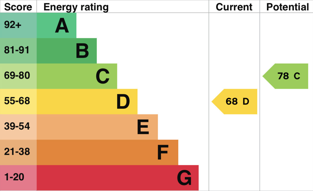
On an estate agent’s website you might see a reference to this rating in words, for example “EPC rating B”, or you might see an image of the rating in the context of the entire scale, like this:

Tell me how much my bills are going to be
Most rating types seem obvious to us because we’re familiar with the scale. For example, star ratings are usually out of five. More stars means a better score. It’s a de facto standard for reviews and product ratings.
While the EPC ratings are similar to academic grades (A-G), I’m not sure they easily translate to the context of energy use. The scores are a bit abstract. But there is something most people understand very intuitively: money. The actual cost of energy doesn’t need an explanation, it’s already concrete. It also happens to directly answer one of the big questions people have when choosing a home: how big are my bills going to be?
The EPC assessment includes an estimation of the cost of energy needed for heating, lighting, and hot water use. So why not put this number upfront? (The diagram below shows how an EPC certificate header looks on GOV.UK (left). On the right: one idea for bringing the energy costs more upfront.)

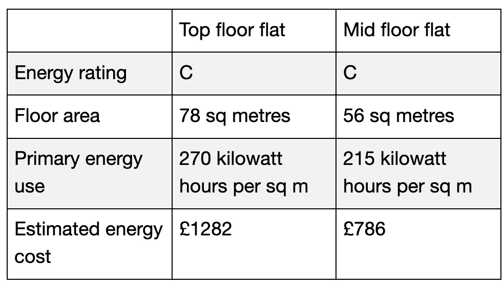
There’s another reason why focusing on the costs provides more information than a simple rating: two properties could share a rating but have a different cost to run. Have a look at these two flats from the same building:

Even within the same rating band the energy use per square metre can differ significantly. The larger the property, the more space needs to be heated. So if you want to estimate your future bills, then using the estimated costs gets you closer to that goal. Of course the actual bills will depend on your specific habits, but it’s a good starting point.
(As a side note, the estimated costs are currently calculated when the assessment is made. Because the certificates are valid for 10 years, those costs can become wildly out of date. Leading with costs would only make sense if they could be calculated based on the latest energy prices for all properties, making comparisons more fair.)
Meet me where I am
One thing I picked up on in forum discussions is that not everyone knows that EPCs even exist, never mind knowing how much information they can find in the report. Though most estate agent listings include the energy rating itself, it’s rare to see links to the certificate, even though they are all available online on GOV.UK. (seriously, have a look! Check out the certificate for your home.)
What could make them easier to find? Social media sites often allow embedding a single post somewhere, for example in an article. What if GOV.UK gave everyone an option to embed a button with a summary of the EPC, and a link back to see the rest of it? If the energy costs change, or a new certificate is issued for the property, then the embedded module could automatically update with the latest info. There could even be a printable badge with an easy way to direct someone to the online certificate.

Let me get a quick overview
GOV.UK already does a great job of summarising each EPC in plain language, starting with the most important detail. I think it could be even easier to scan quickly by using visuals and interactions. For example, the breakdown of property’s energy performance shows the rating of each component of the score: walls, roof, windows, the heating system, and so on. They all get a rating on a five-point scale from very good to very poor, presented in a table. Brains process visuals much faster than they do words, so there’s an opportunity to turn this section into something that can be understood at-a-glance. (The diagram on the left shows the way the energy performance of each component is summarised on GOV.UK. On the right: an example how a small visual cue can help with scanning the ratings.)

Each EPC suggests improvements which would increase the energy efficiency of the property. Each step builds on the previous one in terms of energy saving, so the recommendation is to follow them in order. Presenting the cumulative savings in an interactive way (as shown in the video below) could help someone make sense of the impact of the recommended changes.
Put the property rating in context
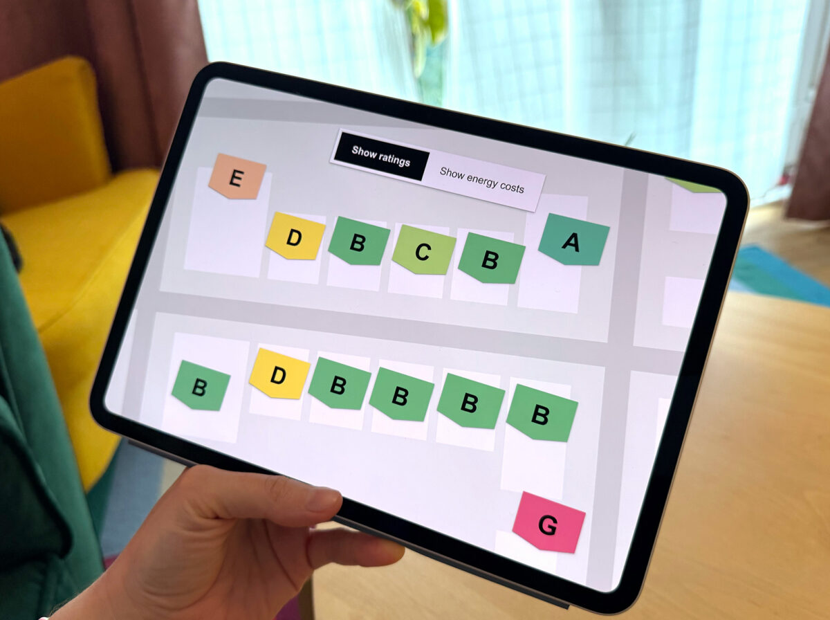
The EPC data is collected in a publicly available dataset. It got me thinking about whether it could be useful to show the ratings of properties nearby, to allow a comparison in a given area.
Here’s an example: I found a house I like, and I love the area. On the same street there are many properties built around the same time, perhaps by the same developer. As a consequence their energy ratings are similar to each other. I can clearly see that it’s going to be hard to find a home with a much higher rating, at least in this neighbourhood. I might decide to buy and invest in the energy efficiency of the house I like, instead of trying to find one which is already as efficient as I’d prefer. (The map view below could show the efficiency of homes in a given area.)

Smaller bills mean smaller CO2 emissions
All of the ideas I shared here include *only* the information already included in the energy performance certificates. I was curious to see what I could come up with without relying on ideas about policy changes or new infrastructure, to explore how hard it would be to get even more out of what already exists. Without this constraint it would be interesting to think about ways to predict energy costs based on your specific usage and habits (rather than typical figures), predicting energy savings resulting from improvements over time (taking into account inflation), or perhaps ways to find properties that match your specific criteria that go beyond the rating (eg. ones with double glazing).
I’m not proposing my suggestions ought to be immediately developed. For one, I’ve not tested them with the public to see how well they’d perform. But I hope I was able to show you that the benefits of doing these assessments could potentially reach even more people. Every time someone is able to pick a more energy efficient home they can save on bills. When there are strong incentives to make homes as energy efficient as possible we all benefit from lower CO2 emissions. And I like that.


